- Home
- Brand
The O is a light.
The idea
A wordmark that draws the light.
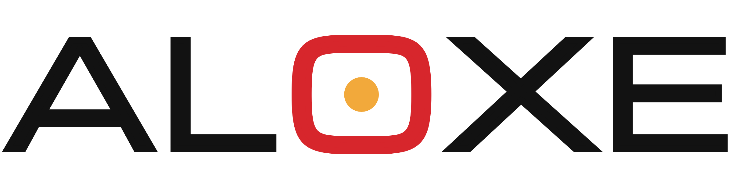
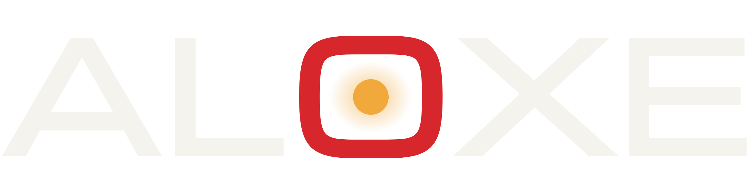
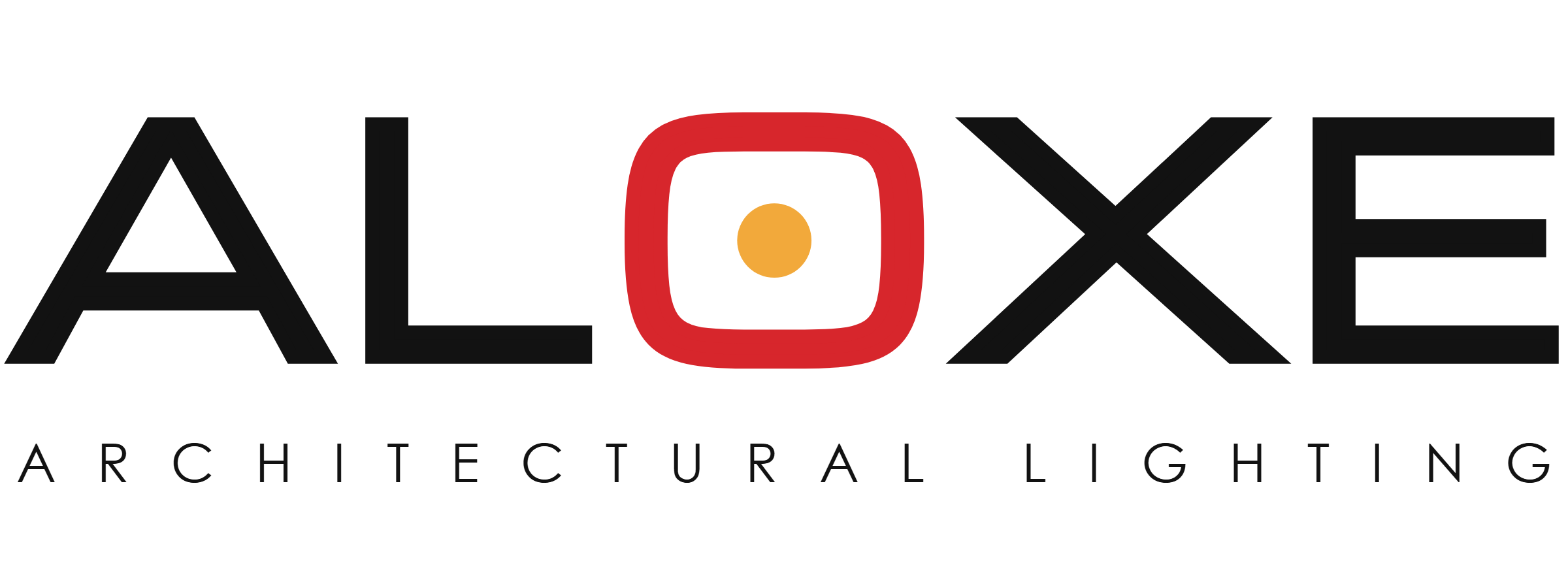
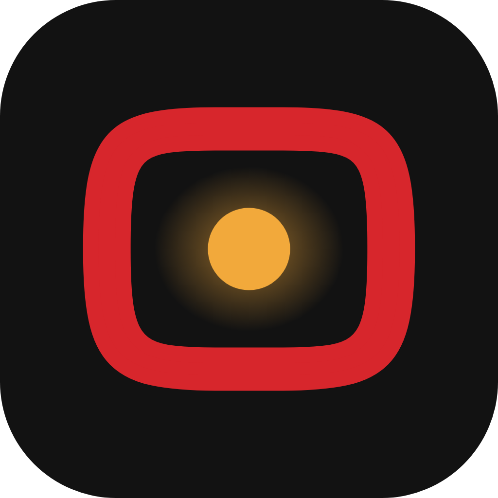
The wordmark is set in Michroma, an extended architectural sans, and supplied as outlines. Its O is drawn as a luminaire seen from below — a Signal Red housing around a warm Lumen core — so the name itself carries a light, from a 16-pixel favicon to a building facade.
Logo
Variants




Symbol
The lens, on its own.
For favicons, app icons, social avatars and product labels — wherever the name is already present or space is tight.


Colour
Mostly paper and shadow. A little light.
Signal Red
#D7262CRGB 215 38 44CMYK 0 95 85 5The lens. Logo O, primary actions, model numbers.
Lumen
#F2A93BRGB 242 169 59CMYK 0 35 85 0The light itself. Lens core, highlights, warm accents.
Carbon
#121212RGB 18 18 18CMYK 0 0 0 95Wordmark, text and the night-time stage.
Ivory
#F5F3EERGB 245 243 238CMYK 0 1 3 4Paper. Default page and catalogue background.
Concrete
#E6E3DCRGB 230 227 220CMYK 0 1 4 10Product tiles, rules and quiet surfaces.
Graphite
#5E5B54RGB 94 91 84CMYK 0 3 11 63Secondary text and specification labels.
Typography
Geometric, calm, one warm accent.
Display
Aa
JostHeadlines and product names. 300–500, tracking −2%.Text
Aa
InterBody copy and interface. 400–600.Specification
Aa
JetBrains MonoLabels and model numbers, uppercase and tracked.Accent
Aa
FrauncesLight italic — one phrase per headline.Downloads